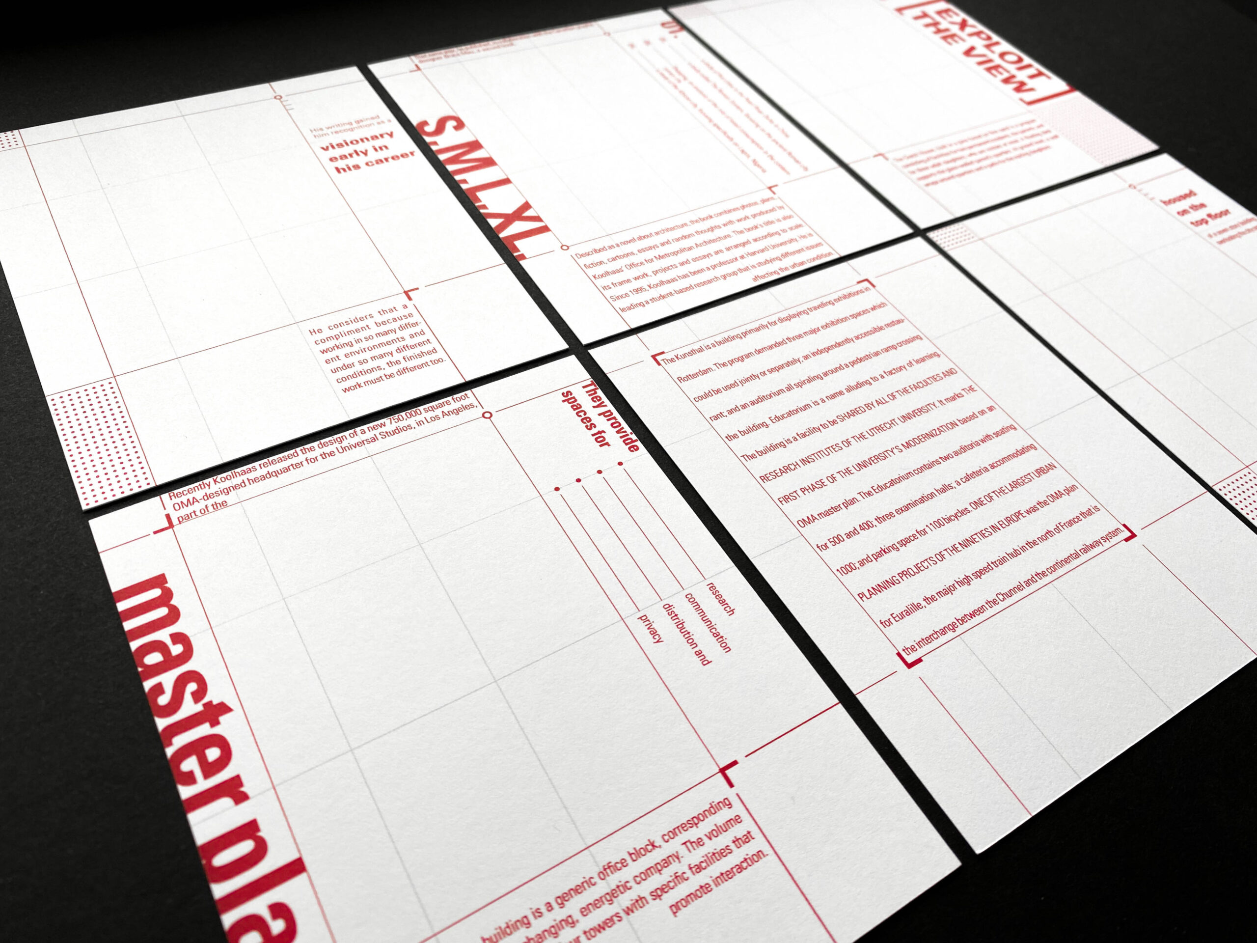
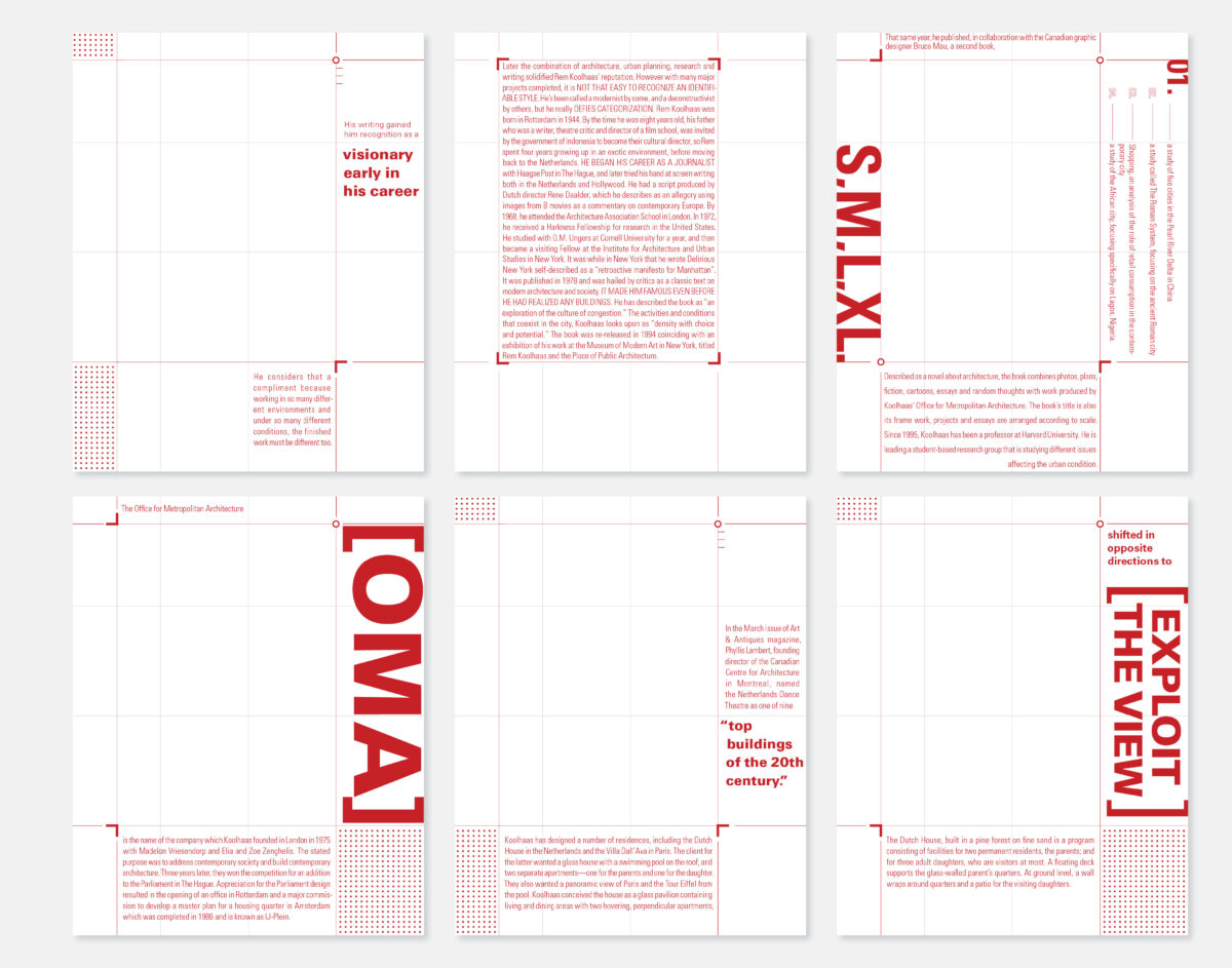
Utilizing the design philosophy of architect Rem Koolhaas, the goal of this project was to design three systematic pieces that reflect his architectural design approach if applied to typography. The project consists of six cards front and back, an accordion book, and a poster all using the same typographic language and elements to achieve its systematic look.
Project Type
Conceptual Typography
Date
Fall 2021


Design Philosophy

Rem Koolhaas designs his buildings to accommodate the user. His style of architecture isn’t tied down to any specific category, rather he places his focus on the needs of the people and determines the form according to how the space will be used. Whether that be environmental constraints or specific requests, Koolhaas takes into account first and foremost how the space of the building can best serve its occupants.


Cards, Book, and Poster

Using Koolhaas’s philosophy, I created my concept of customizing a grid system that demonstrates the different uses of the grid and its space. The grid for this project remains the same for each part, following the same ratio but in increasing sizes from cards to book to poster. The cards focus on emphasizing the margins of the grid, the poster emphasizes the columns, and the book emphasizes the rows/horizontal columns.